17th Century Print Pack

This Single Typeface pack
contains a family of two fonts:
17C Print and 17C Italic
Important Note:
The full character set can be accessed in any Windows or
Macintosh application, but extra functionality is
available with OpenType/AAT enabled applications. See advanced type for full
details.
Typeface display:
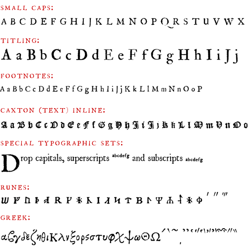
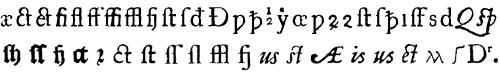
Some of the extra historical characters
provided:
OpenType Features:
           
 
 Text (Caxton-style) glyph set Text (Caxton-style) glyph set
 Footnotes glyph set Footnotes glyph set
 Drop capitals glyph set Drop capitals glyph set
AAT Features:
Standard Ligatures, Historical Forms, Historical
Ligartures, Latin Abbreviations (general), Latin
Abbreviations (specific), British runes, Transliteration,
Stylistic Variants, Optical Size, Vertical Position,
Letter Case, Medieval English Usage, Mathematical Symbols,
Glyph Variants.
[OpenType
Feature Key | Advanced
Type Information]
Historical note:
The advent of the printing press saw the early type
designers, typified by Guttenberg and Caxton, striving to
reproduce the contemporaneous written styles, which, in
the early fifteenth century were based on various forms of
text hand. The Humanists of the Italian Renaissance wanted
a ‘new’ writing style and they found inspiration in the
the old tenth century Carolingian hand, through its clean
and elegant form. In deference to its roots it was known
as Littera Antiqua, and, coupled both with a cursive,
forward slanted variant known as Italic, and Roman square
capitals, it became the de facto style across Europe, by
the beginning of the sixteenth century (although notably
not in the Germanic countries where text hand remained the
standard). Inevitably, the printers embraced this new
writing style as the standard and most legible typeface.
Such was its success, that there really is very little
difference between this and the ‘roman’ typestyles of
today
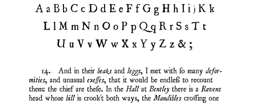
The 17C Print OT fonts were taken from a book published
in 1686; they were designed to incorporate not only the
imperfections but also the art of seventeenth century
printing, including many glyph variants based on optical
size, ligature, alphabet and typestyle.
|