Sightings!
Our typefaces have been purchased by a number of interesting persons and organisations, and from time to time we see them used in strange and wonderful places…
If you happen to recognise one of our fonts in the public eye, please let us know at sightings@crazydiamond.co.uk!
| Sighting | Details [Typeface(s)] |
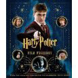
| Harry Potter Film Wizardry See it at amazon.co.uk  | A book describing the props used throughout the Harry Potter films, by the designers who created them. Contains many pull-out examples. Many of these contain our typefaces. |
| Harry Potter and the Goblet of Fire, film (Warner Bros.) | In this latest film, it is revealed that the wizardly world’s daily newspaper, the Daily Prophet, is typeset in Formal Text Hand, with Italic Hand used for picture captions. We always knew the wizard press had good taste. |
| “Galloglas: Hebridean and West Highland Mercenary Warrior Kindreds in Medieval Ireland” by John Marsden. See it at amazon.co.uk | The cover displays the ‘G’ in Bastard Secretary, and ‘alloglas’ in Secretary Hand. Design by James Hutcheson. |
| Writing the Past, by the King Edward’s School Living History Group, Staffordshire. Click to see larger-sized cover | The cover of this “guide to the methods, materials and manners as well as hands used between the years 1300-1660” is created using our 17th Century Print hand, alongside a woodcut. |
| Harry Potter and the Prisoner of Azkaban (Warner Bros.) 2004 DVD at Amazon.co.uk | The cover of the Monster Book of Monsters is rendered in Bastard Secretary in large golden letters (“The Monster Book of…”, as it chases Harry around his bedroom. |
| “Pride and Promiscuity: the lost sex scenes of Jane Austen” by A. Eckstut, ed. (Canongate) 2003. See it at Amazon.co.uk | 17th Century Print is used to create the entire cover page for the hardback edition of this whimsical parody. |
| Harry Potter and the Chamber of Secrets, DVD (Warner Bros.) April 2003 See it at Amazon.co.uk | On DVD 2, the following extra features show our fonts in dramatic style: – Additional Scenes: Gilderoy Lockhart hands out a self-referential quiz written in our Secretary hand. – Behind Hogwarts: Dumbledore’s Study On Dumbledore’s desk, there is a mysterious open book written in our Italic hand. – Gilderoy Lockhart’s Classroom: The Certificates display several of our fonts. In particular, the first in the sequence shows off our Secretary hand to excellent effect. The books shown in Required Reading feature one or two of our fonts in the titling and background. |
| Alice Simpson, “The Dancing Chancellor” handmade book. | 17th Century Print is being used by Alice in the creation of a hand-made book detailing the life of Sir Christopher Hatton, dance instructor to Queen Elizabeth I. Further details on the book will appear when it is published. See a report and illustrations of her previous fine books at: http://www.craftsreport.com/current_issue/profile.html |
| Harry Potter and the Chamber of Secrets, film (Warner Bros.) November 2002 See it at Amazon.co.uk | The book of “Most Potente Potions” which Hermione browses in the library [Chancery heading, 17C main text]; Gilderoy Lockhart’s examination papers [Secretary Hand]. Other minor props. |
| “The Scottish Enlightenment” by Alexander Broadie (Birlinn, ISBN: 1841581518); 2001. See it at Amazon.co.uk | All text on front and back cover (including barcode!) [17C Print and Italic]. Design by James Hutcheson. |
| “Production for Graphic Designers”, Third edition, by Alan Pipes (Laurence-King, ISBN: 185669268X); 2001. See it at Amazon.co.uk | Page 32, detailed illustration of ‘archaic English’ characters, pointing out the Thorn, [Formal Text Hand]; also on the page, a photograph of A New Newe Booke of Copies. |
| Harry Potter and the Sorceror’s Stone, film (Warner Bros.) November 2001 See it at Amazon.co.uk | Various minor props throughout film; most notably the Hogwarts Express train ticket [17C Print]. |
| Channel 4 (UK), The Great Fire of London documentary, September 2001 | Titles in advertisements and throughout programme [17C Print] |
| “The Book of Martin” by William D. Bevis (Gadsden, ISBN 0615119697) 2002 | Whole book typeset in 17C Print and Italic in two columns, with drop capitals and large headings. |
| Royal Shakespeare Company, The Barbican. London. 1991 onwards. | The RSC have used our typefaces to produce on-stage props ever since our first releases for the Amstrad PCW. |
